Problem
“How do I enroll in a course?”
Saylor Academy
Saylor Academy is a non-profit based in Washington D.C. that provides access to free higher education courses. Students have the possibility to obtain transferable credits from some courses in order to complete their associate or bachelor degrees.
Project details:
My Role: Project Lead, UX Designer and Researcher, Developer
My team: My manager and myself (UX Researcher, UX Designer, Project Manager, and FE & BE Engineer)
Tools: Screencast-o-matic, Sketch, Pen&Paper
Deliverables: UX Research Report, Presentation, Wireframes, Solution implementation on front and back-end
Go through the enrollment process yourself here.
Defining the problem in order to build the correct user research process
For a platform that offered free, online, university-level courses, having over 50% of visitors drop-off from the enrolment page or emailing their frustration was disheartening. Although we were investing more heavily on user acquisition via social media and academic partnerships, and a growing traffic on our courses page, it wouldn’t necessarily convert to enrolment. My job was to find out why and fix it.
Our hypothesis: We believe that potential students are not successful in enrolling in the course because they cannot find the enrol button. If we change the placement of the enrol button, the drop-off rate will reduce by at least 50%.
After defining the problem statement, and consulting with professional UX Researchers, I put together a research project to test our hypothesis. By reviewing existing data and running usability testing and interviews, I was able to empathise and discover what were the users’ pain points as they went through the enrolment process on our platform.
Inform and align with stakeholders
Key takeaways from the research:
enrolment button was hard to find (taking most users over 2 minutes to find it)
user wasn’t informed that in order to complete the sign up process, they would need to verify their email address by checking their inbox
updating the UI and progressive disclosure was needed to keep students engaged
I shared the research report and then presented my finding to my stakeholders which comprised mostly of program managers and academics. By changing the conversation to being more data-driven, we were able to align on the next steps. I then defined a roadmap with sprints to prioritise the features we would need to work on.
Finding possible solutions
I went through a few different iterations while also keeping in mind my technical limitations in implementing the fixes.
The main changes we focused on were:
making the enrol button more discoverable
have an eye-catching pop-up that informs users to confirm registration by checking their email
setting-up a new Moodle template with a more updated look
Validate the new flow
In order to understand if our solution would work, I ran a second usability test with 8 participants who were able to easily enrol in a course, confirm their registration and had mostly positive feedback to give about the new look too. Once the new flow was validated, I worked on implementing the front and back end solution in Moodle.
Reduction of drop-off rate
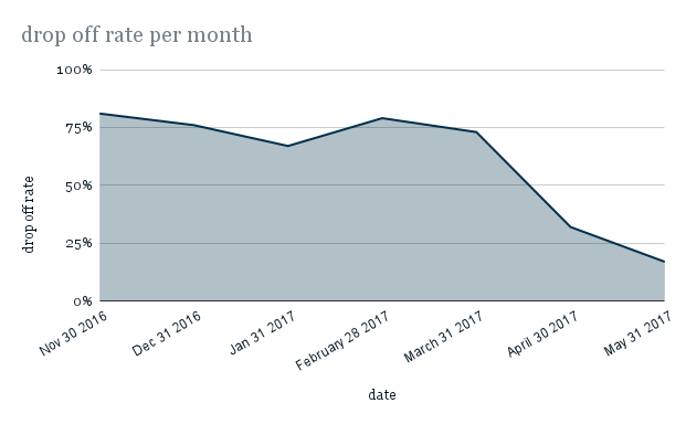
As the graph shows, once the changes were implemented into our platform, there was an impressive reduction of around 85% in drop-off rates on the course page within the first months.
Reflection from the pilot UX project
Better alignment within the organization was needed from the start to garner support for the project.
A key learning was the importance of pushing for data-driven decisions to drive the much-needed change.
Once they saw the impact, internal stakeholders became more open to running additional UX projects.


